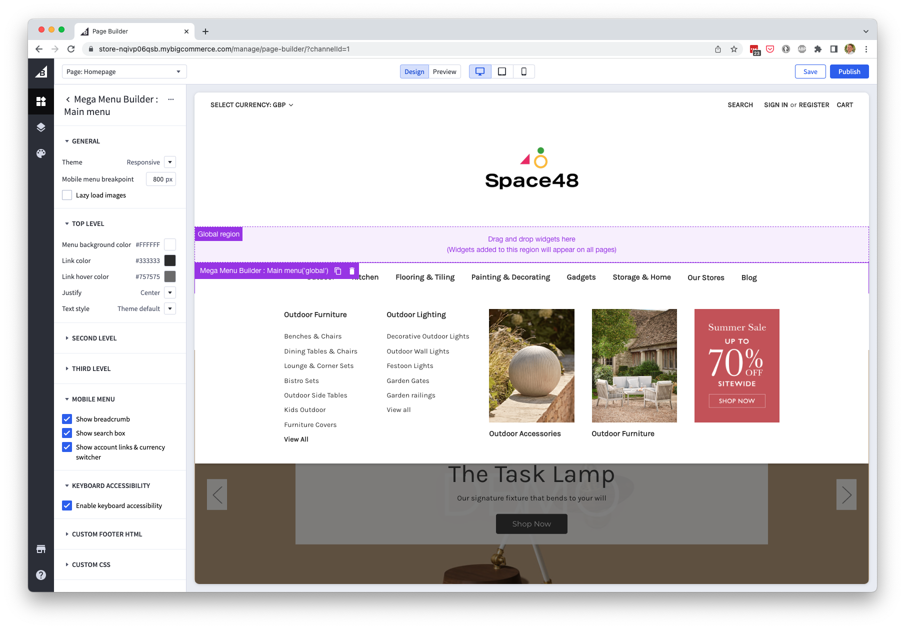
Mega menu design options
Use menu item design options to control column layout, image treatment and content wrapping.
Top-level menu items
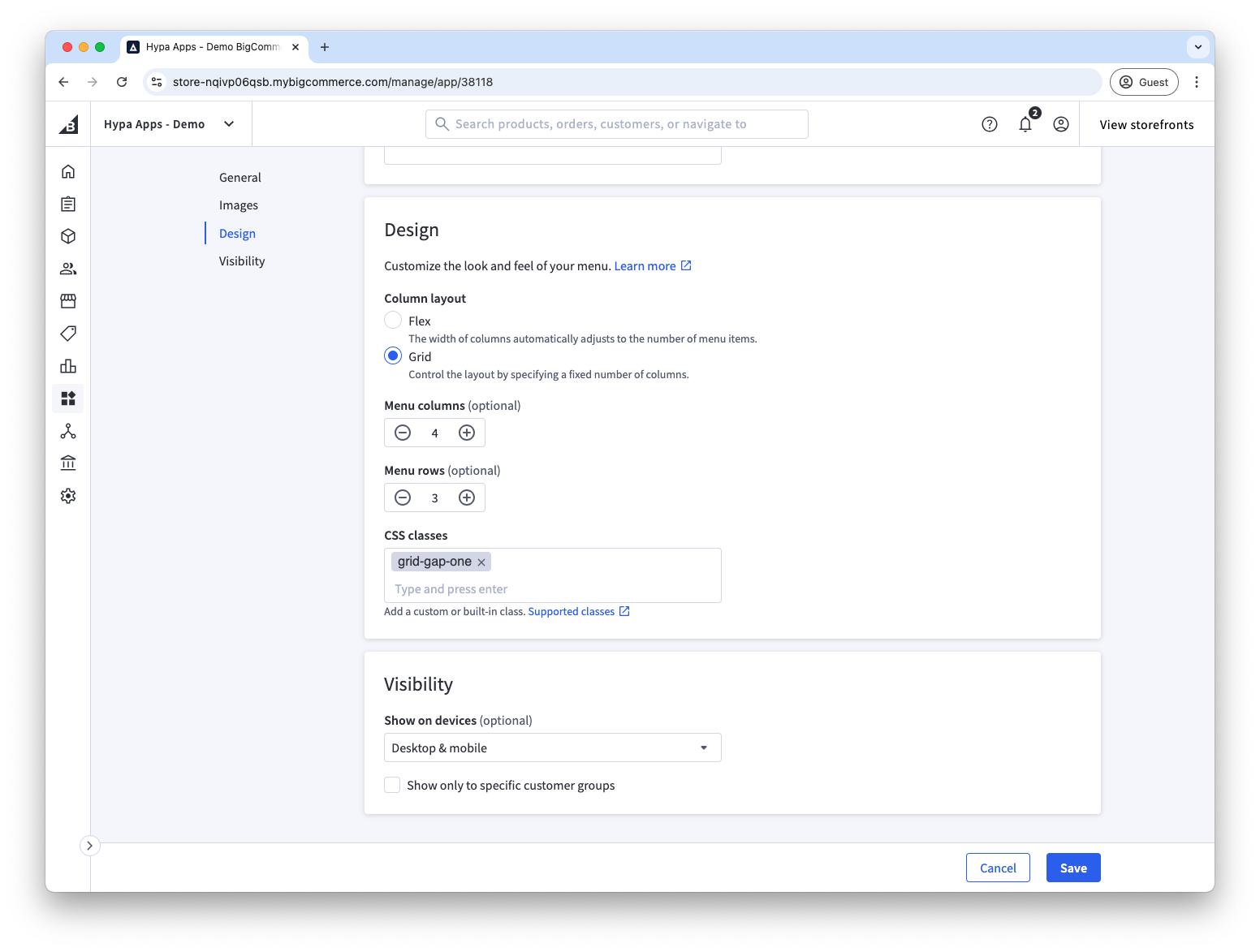
On top-level menu items, you can choose how the flyout mega menu should be shown.
- Flex (default) automatically sizes and spaces columns.
- Grid uses a fixed number of columns and supports column and row spans.
Flex is the easiest choice to get started. Grid is helpful in creating more advanced layouts.
Second-level design options
On second-level menu items, you can choose how the column of links (third-level menu items) is displayed. We provide a few different options.
These options are only available on menu items on the second level of your menu (i.e. a child of a top-level menu item).
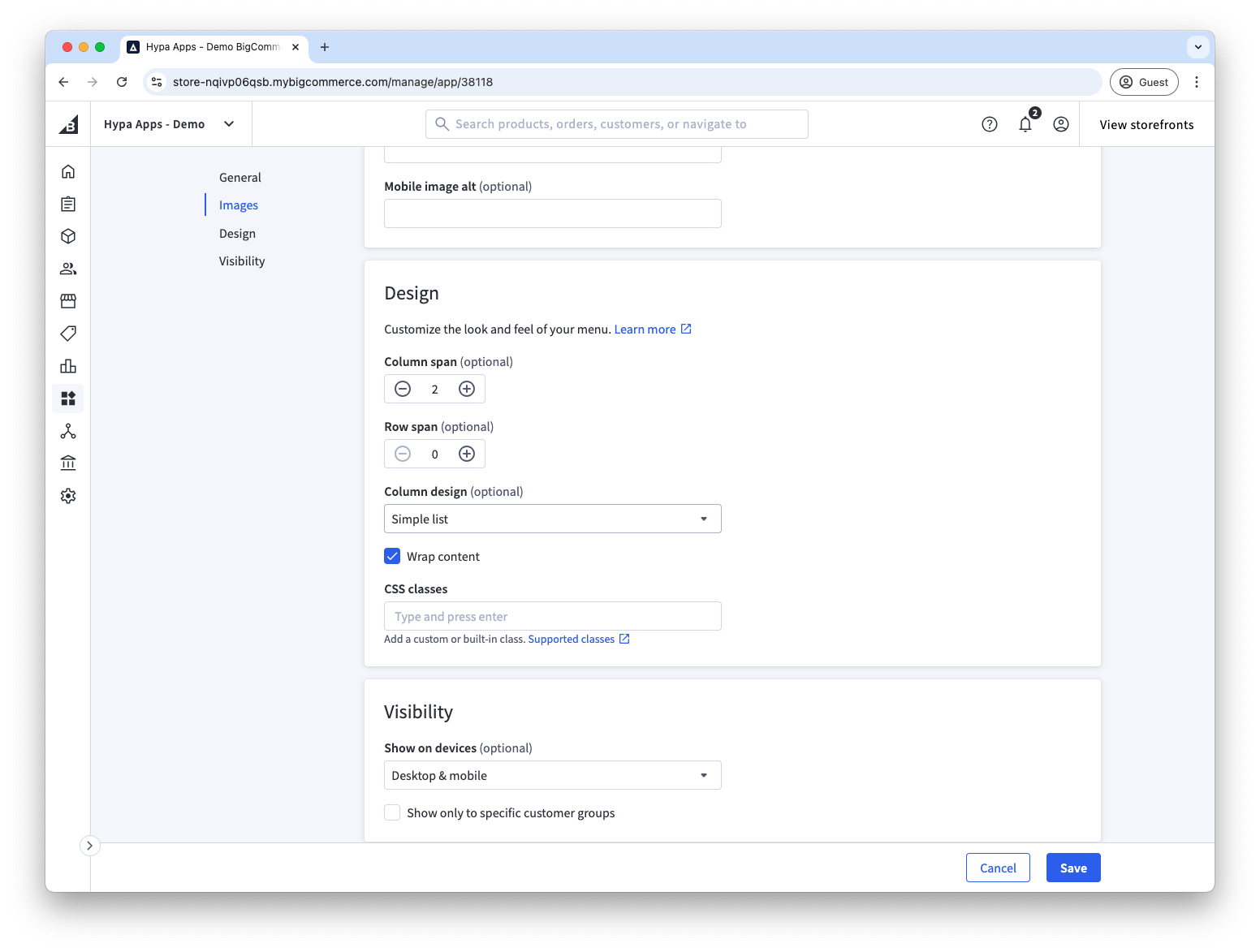
Column span
This is the number of columns that this menu item should use. Defaults to 1 and is only available when using the Grid Layout.
Row span
This is the number of rows that the menu item should span. Default to automatically spanning all rows. This can be useful in advanced layouts that use multi-row-grids. E.g. having a three row grid, where a couple of smaller lists are manually set to a Row Span of 1 will ensure that they stack.
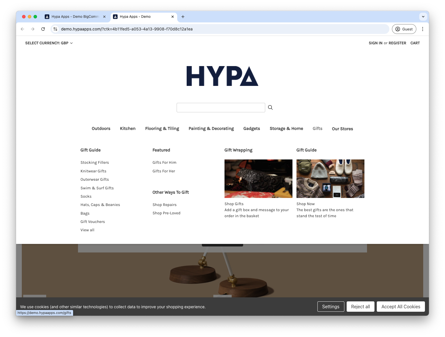
Column design
Choose how the column of menu items should be shown.
See Column design options for worked examples.
- Simple (default) shows a list of links.
- Images inline shows each link's image in a circle beside it.
- Images only creates promotional image blocks without link text.
- Hidden creates an empty gap in a grid layout.
Wrap content
If your menu item spans multiple columns, you can use this option to spread the list across multiple columns. See examples on wrapping lists.
Customise the menu with Page Builder
For background colours, text formatting and other storefront-wide styles, configure the Page Builder widget.