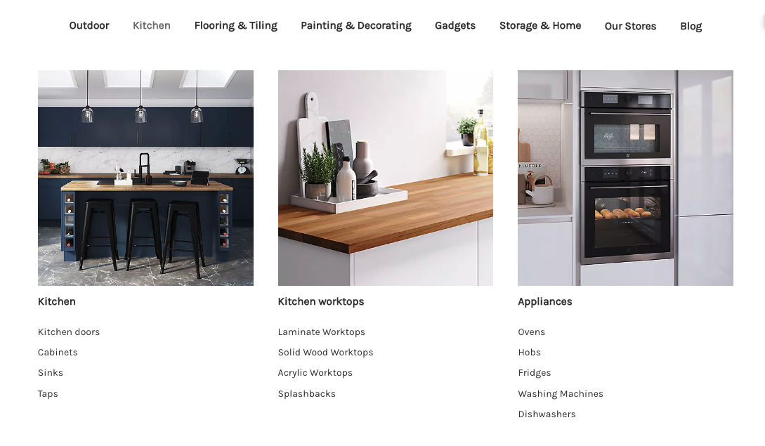
Example menu: Featured images
A common mega menu layout places navigation lists on the left and featured image links on the right. The example below uses an Outdoor menu to demonstrate the structure.
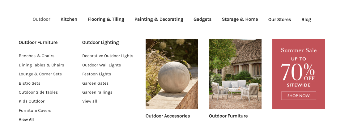
Build the layout
Here's a breakdown of how this kind of menu design can be achieved.
Menu structure
We recommend three levels of menu items for most menus. Here the top-level menu items are "Outdoor", "Kitchen", "Flooring & Tiling" etc. On the second level, we have "Outdoor Furniture", "Outdoor Lighting", "Outdoor Accessories", etc. Finally, at the third level, we have "Benches & Chairs", "Dining Tables & Chairs", etc.
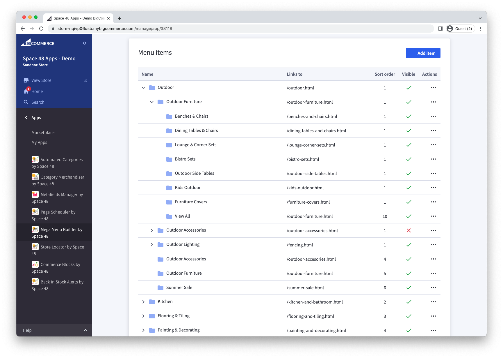
List of links
The list of links is the default way that menu items will be shown.
View All link
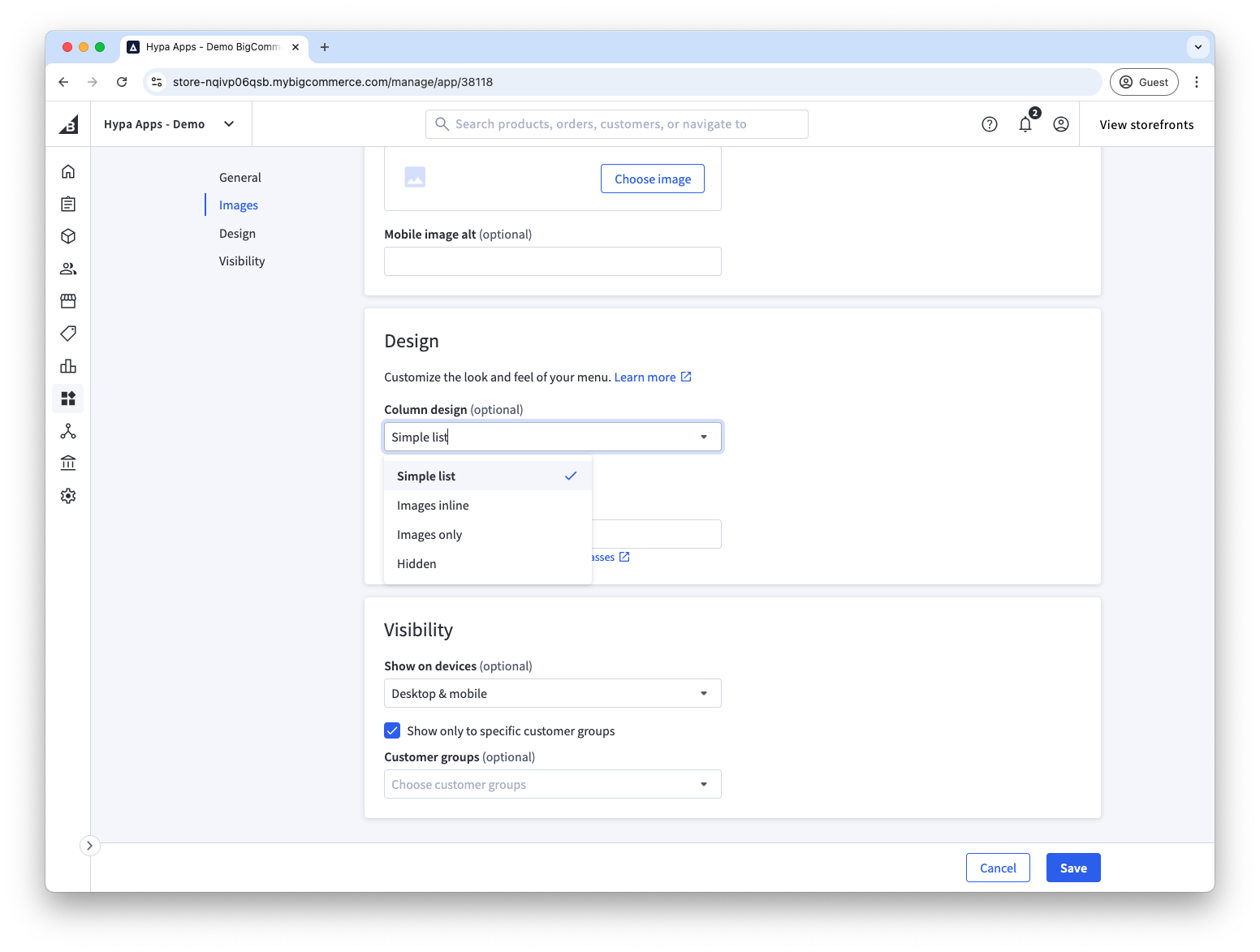
It's common to want the final link in a list of links to be styled differently, e.g. to advertise a "View all" or "Shop all". In our example, we've simply made it bold. This has been achieved by adding "bold" to the custom class list. We have a selection of built-in classes that can be added to a menu item to tweak the design.
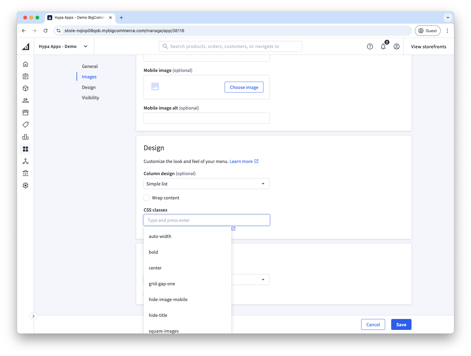
Featured images
To achieve the featured image on "Outdoor Accessories", we have simply added an image to the second-level menu item.
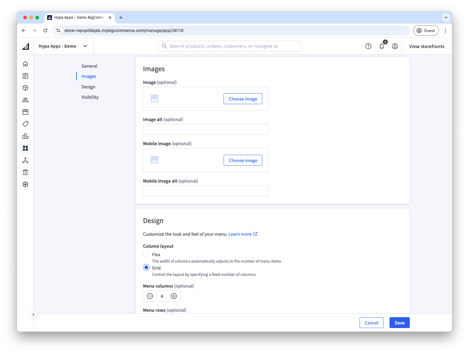
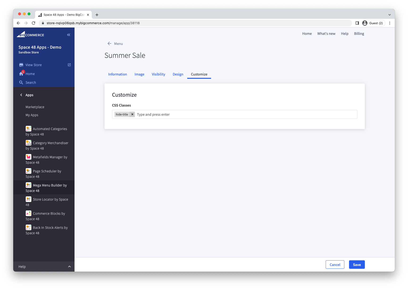
To place the Outdoor Accessories heading before its image, add the title-first class. Alternatively, create a third-level item beneath it, assign the image to that item and point both items to the same destination. Add hide-title to show only the third-level image.
The final sale image uses the same approach: it is a second-level item with the hide-title class.
Images on second-level menu items
The "Kitchen" top-level menu item uses images in a similar way. The main difference is that they are added to the second-level menu item while also having a list of links beneath each of them. This creates a nice effect where the three lists of categories have an over-arching image that helps to capture the essence of the category and therefore gives direction to the customer without having to read the link.