Example menu: Multiple rows
There are times when you have a larger number of second-level menu items, each with a smaller set of links sitting beneath them. In this situation, it can be better to allow for multiple rows of menu links.
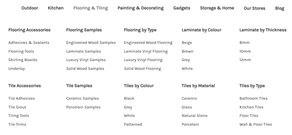
A grid of second-level menu items
By default, the mega menu app will automatically adjust column widths so that all are equal size and fit on a single row.
For more control, switch the top-level item's design option to Grid and choose the number of columns. This example uses five columns.
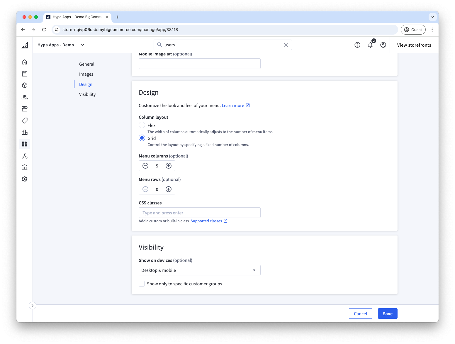
That's all that's needed to create this kind of menu. No special settings are required on any of the second or third-level menu items. Once you've added five second-level menu items, the sixth second-level menu item will be positioned on the next row.
A grid of third-level menu items
People recognise images faster than text so a grid of images can be a useful technique in guiding customers through the site navigation.
In this example, we have "All Gadget & Tech Gifts" as a second-level menu, and then each of the third level menu items have images uploaded to them.

To create this five-column grid, set the top-level Gadgets item to a grid of five columns on its Design tab.
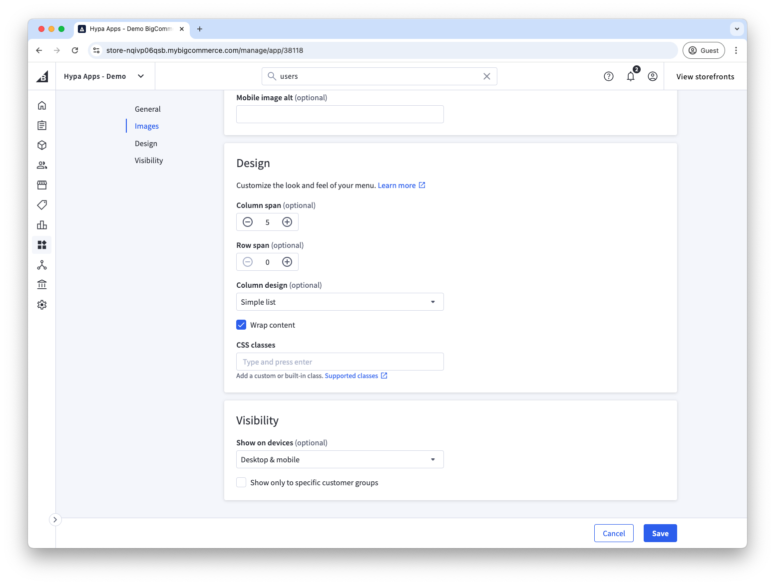
Then on the second-level "All Gadget & Tech Gifts" menu item, we have told it to span 5 columns. This means that it will be full-width. We have also ticked "Wrap content" to ensure that the children will wrap to make use of all the available space rather than be in a single column.
For more information read our guide to wrapping lists.