Column design options
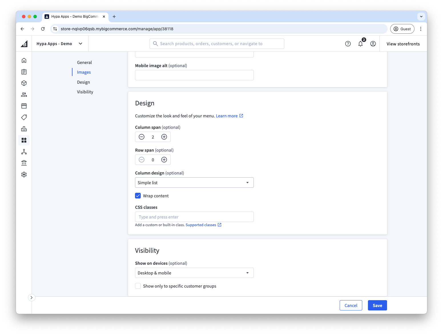
Set a column design on a second-level menu item to control how its child links appear.
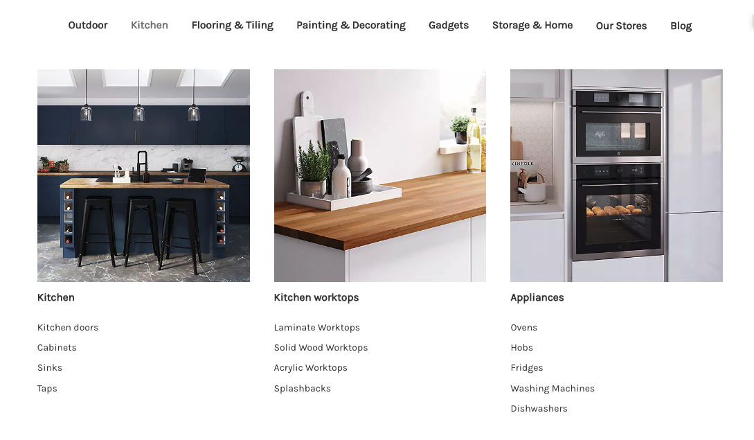
Simple
The default column design option simply shows menu items in a list. In this instance, additionally, the second-level menu items have images assigned to them.
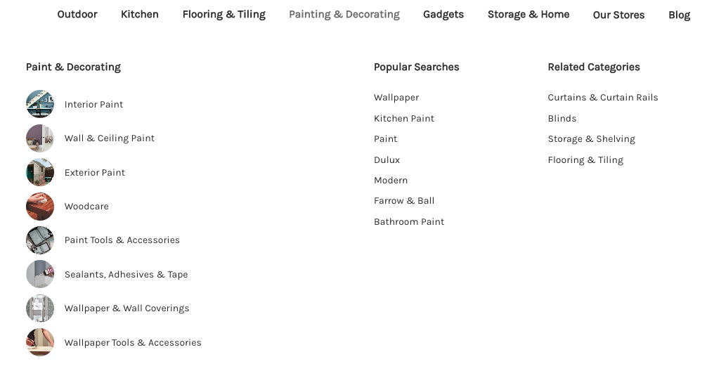
Images inline
This design option changes the way that images are shown when assigned to third-level menu items. They are shown inline within circles.
To show square images instead of circles, add the square-images CSS class to the second-level item on its customisation tab.
Images only
When set on the second-level menu item, the titles/names of all third-level menu items will be hidden and only their images will be shown. This can be used to create image-only promotional blocks.
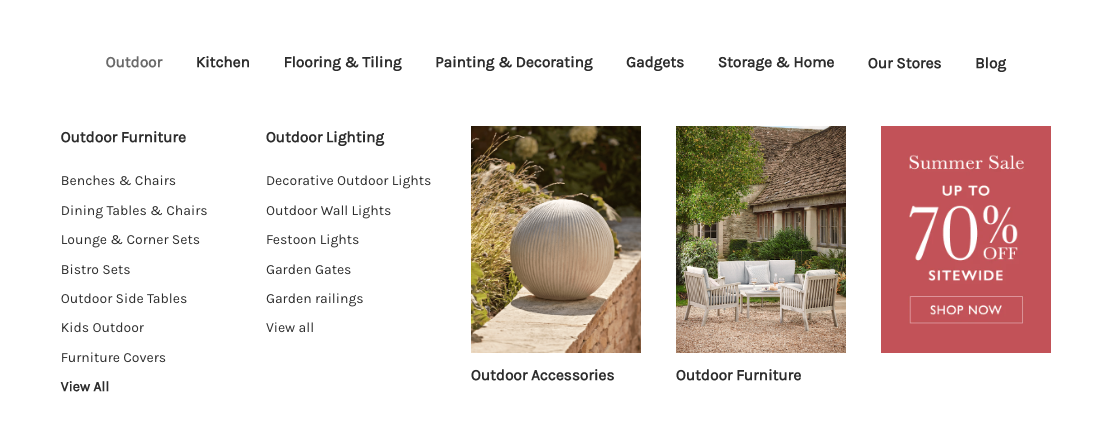
Hidden
Use Hidden to create an empty column and add space between items. This is most useful when the top-level item uses Flex. With Grid, create empty space by adjusting the column spans instead.